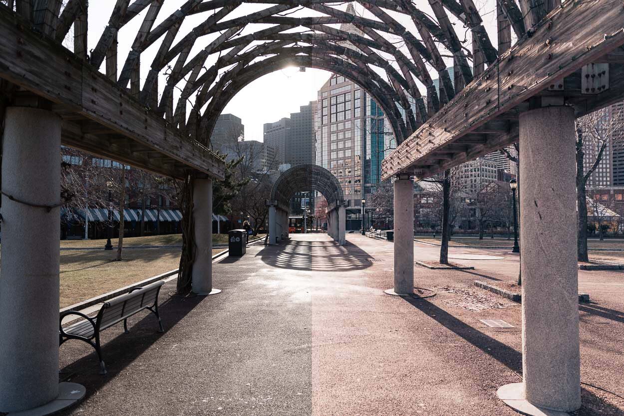
My Lightroom Preset for January's Instagram Posts
 Before (L) and After (R)
I created a Lightroom Preset for all my posts going up on Instagram in January.
Why, you [didn’t] ask?
Because I want my grid to have a cohesive feel to it so that people will follow me. Having 100K Instagram followers is one of my 2019 goals. At the time of this writing I have just over 1000. Almost there! :|
But experts tell us that having a consistent/cohesive Instagram grid is better, more aesthetically pleasing, and more likely to attract followers.
Plus, I just like the way things look when they all go together.
So I made a Lightroom Preset.
And I’m giving it to you.
For free.
Follow me on Instagram here.
Note: In the After image (the one on the right), I bumped the exposure up a third of a stop. So if you apply the filter and get all made at me because it doesn’t look EXACTLY like the one here, that could be why.
If none of this makes any sense because you’re a Lightroom newbie, that’s okay, I’ve got you covered!
Or it could be because you took a better photo [Ansel Adams, is that you?], in which case, why are you even here? You should be on a yacht celebrating all the money you’ve made selling award winning photos.
If you liked this, you may like my other presets.
Questions? Comments? Drop them in the comments section below!